 brand and contents
 The client for this project is Malak Gazhali, also known as Mak, a designer born in Bologna with Moroccan roots. Her professional goal is to position her creative studio through a comprehensive brand identity that merges technical function, emotional depth, and deep storytelling. The requested atmosphere needed to reflect her personal background and aesthetic preferences, centered around her favorite color, aquamarine blue. Key design keywords included watercolor monochromatic illustrations, organic elements, and soft textures inspired by the Moroccan sea.
The main strategic challenge lay in translating a rich, multi-layered personal identity into a clean and functional visual system. We had to balance the technical clarity required for a design portfolio with the soft, artistic textures of water and Moroccan landscapes. Our solution involved choosing typography that bridges these worlds, pairing the structured Pangram Sans Rounded Bold for titles with the highly readable Myriad Variable Concept for paragraphs. To maintain a strong digital presence without losing emotional warmth, we implemented slightly irregular, rounded icons and calls to action with translucent backgrounds.
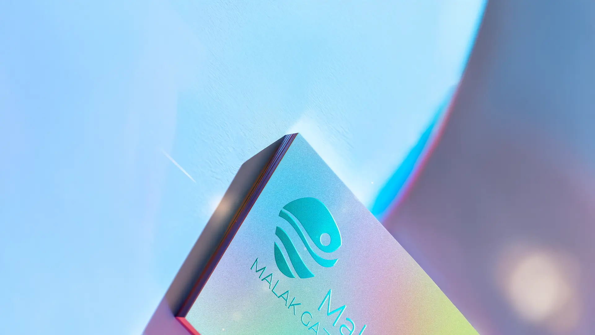
The final creative assets delivered a complete visual identity toolkit. This included a custom logo design featuring an organic fish-like wave icon, a structured color palette dominated by deep blues, whites, and aquamarine accents, and a distinct tone of voice guidelines. The system was successfully rolled out across key web interface layouts, as seen in the website header, alongside specific design sheets. This cohesive identity positions Mak as an innovative, culturally rich professional ready to attract high-end visual communication projects.
