 product
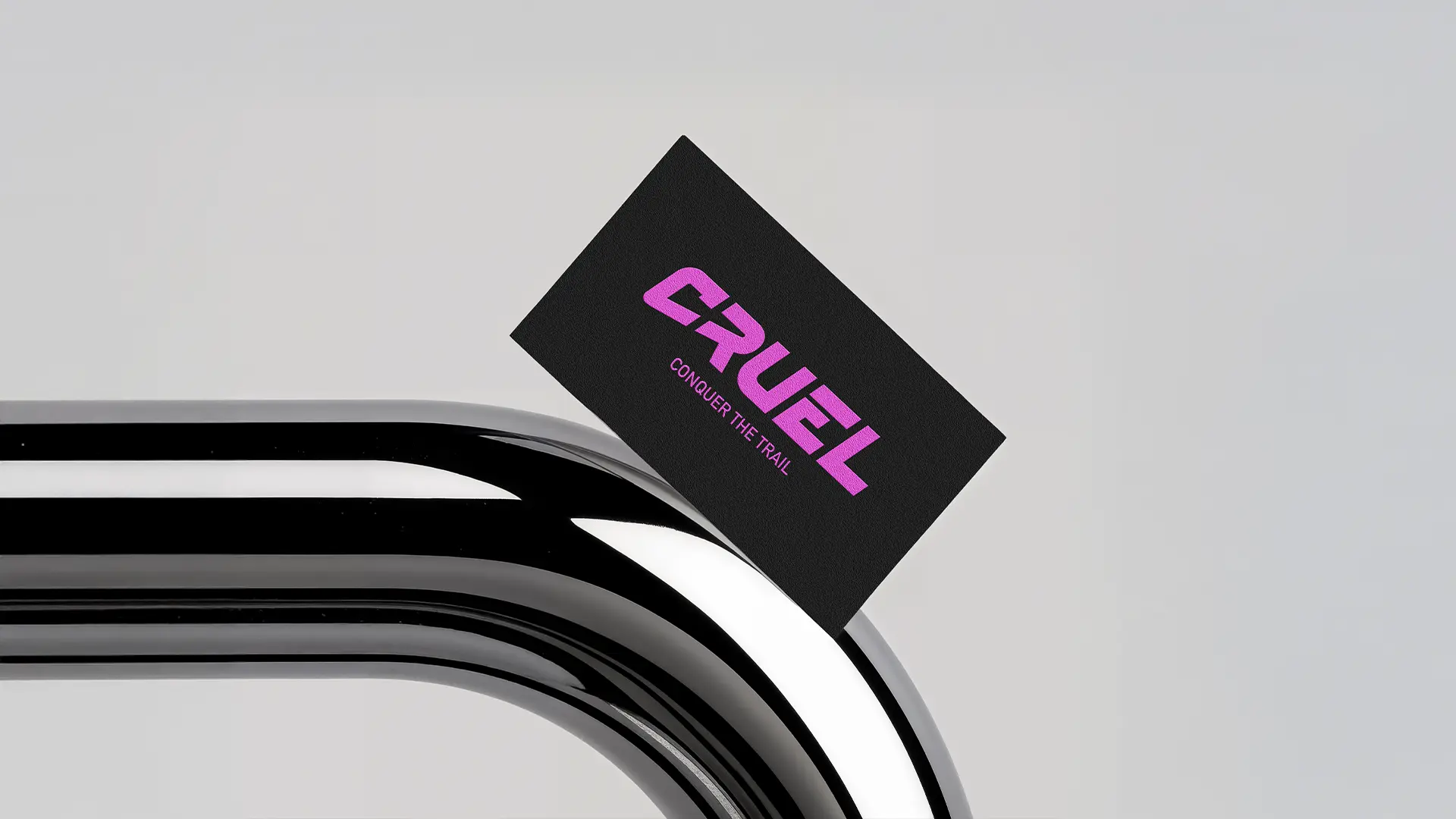
 Cruel Components, an established brand renowned for manufacturing ultralight aluminum bike parts, needed a fresh visual identity to match its high-tech engineering. The goal was to modernize the brand’s presence without losing the trust of its core cycling community. The project required a clean, technical aesthetic that conveys precision, durability, and extreme lightness, ensuring the brand stands out in the competitive premium cycling market.
The main visual identity challenge was executing a logo redesign that balanced technical precision with minimalist aesthetics. We needed to translate the concept of premium CNC-machined aluminum into a geometric icon. The strategy focused on stripping away unnecessary elements to mirror the product’s core benefit: removing weight to increase speed. Additionally, crafting a new payoff required a concise phrase that instantly aligns with the brand’s engineering expertise and premium positioning.
The final project delivered a fully cohesive visual package, including the redesigned logo asset family and the new corporate payoff. We provided an updated brand identity guidelines manual detailing typography, color palettes, and digital asset application. This streamlined aesthetic successfully reinforced the brand’s premium market position, significantly improving brand recognition among professional cyclists and high-end bike builders who value top-tier aluminum components.
